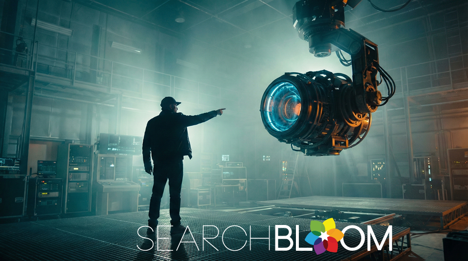
How to Write AI Image Prompts That Actually Look Professional
Most AI-generated images share the same problem: they look obviously fake. Smooth skin with no texture. Perfect symmetry. Centered compositions. Generic lighting that screams "stock photo." If you have used Midjourney, DALL-E, or any other image generator, you have probably experienced the frustration of getting results that feel more like clip art than professional visuals.
The issue is not the technology. It is the prompts. Most people approach AI image generation like a search engine, typing vague descriptions and hoping for the best. But these models are not search engines. They are creative tools that require direction. Think of yourself as a film director and the AI as your camera crew. If you do not specify exactly what you want, the crew will make safe, generic choices that result in forgettable output.
This guide introduces the S.E.E.D. framework, a systematic approach to writing AI image prompts that produce brand-ready, conversion-focused visuals instead of generic stock photos. Whether you are creating images for blog headers, social media, presentations, or ad campaigns, this framework will transform your results.
Why Most AI Images Look Like Bad Stock Photos
When you give an AI image generator incomplete instructions, it defaults to the safest, most generic options. This is what we call the Default Trap. Without specific direction, models automatically choose centered composition, perfect symmetry, smooth surfaces, ideal lighting, and a generic stock photography tone.
The result? Images that look technically competent but completely forgettable. They have no personality, no brand alignment, and no visual interest that would make someone stop scrolling.
The Director's Rule: If you care about it, you must say it. This is the fundamental principle of professional AI image prompting. Every detail you leave unspecified becomes a decision the model makes for you, and those decisions will always trend toward generic.
Here are the five details most teams forget to specify: time of day, camera distance, dominant color family, surface material and texture, and emotional tone. Missing even one of these can push your output toward that unmistakable "AI generated" look.
The S.E.E.D. Framework for Professional AI Prompts
Every professional-quality prompt must contain four layers. Missing any one of them causes quality to drop significantly. The S.E.E.D. framework ensures you address each layer systematically: Style, Environment, Elements, and Details.
S is for Style (The Look)
Style defines the overall visual aesthetic of your image. This is where you establish whether you want photorealism, 3D renders, or artistic interpretations. The style you choose sets expectations for everything else in the prompt.
For realistic images, use modifiers like "cinematic 4K photography," "shot on 35mm lens," "editorial photography," or "macro photography." These tell the model to aim for photographic realism with specific camera characteristics.
For 3D and tech visuals, try "Unreal Engine 5 render," "isometric 3D," "glassmorphism," "cyberpunk neon," or "clay render." These work well for SaaS products, tech companies, and modern brand aesthetics.
For artistic styles, consider "line art vector," "double exposure," "minimalist flat design," "watercolor," or "pop art." These are effective for creative brands, editorial content, and campaigns that need to stand out from photographic norms.
E is for Environment (The Scene)
Environment covers two critical aspects: lighting and vibe. Together, these establish the emotional context of your image and determine whether it feels appropriate for your brand and use case.
Lighting options include volumetric lighting (dramatic rays and depth), golden hour (warm, flattering, natural), neon rim light (modern, tech-forward, energetic), and soft studio lighting (clean, professional, controlled).
Vibe descriptors set the mood: dark and moody works for serious topics and premium positioning; clean and sterile suits medical, clinical, or minimalist brands; warm and inviting fits hospitality, lifestyle, and consumer products; futuristic and busy works for tech, innovation, and high-energy campaigns.
E is for Elements (The Props)
Elements are the objects and props in your scene. This is where specificity matters most. Vague descriptions produce vague results.
Bad: "Office equipment."
Good: "A silver laptop with a holographic analytics chart floating above the keyboard."
The difference is specificity. The second prompt gives the model concrete visual information to work with, resulting in a more intentional and usable image.
The Sign Trick: If you want text in your image, define how it physically exists. "Written on a neon sign encased in glass" produces different results than "etched into brushed metal" or "painted onto concrete." The physical medium changes the entire aesthetic.
D is for Details (The Camera)
Details define how the camera captures the scene. This includes framing and focus, two elements that separate amateur snapshots from professional photography.
Framing options: wide angle (establishes context and environment), extreme close-up (emphasizes texture and detail), low angle (conveys power and authority), bird's eye view (provides overview and pattern recognition).
Focus settings: shallow depth of field (isolates subject, creates premium feel), sharp foreground focus (draws attention to primary element), soft background blur (reduces distraction, emphasizes subject).
Using Constraints to Eliminate Bad Output
S.E.E.D. defines what you want. Constraints define what you explicitly want to avoid. Think of constraints as guardrails that reduce unusable output and shorten iteration cycles.
Common constraints include: no people (when you need object-only shots), no text (to avoid garbled AI-generated words), no logos (for clean commercial use), no symmetry (to avoid that artificial AI look), no stock photo look (explicitly tells the model to avoid generic aesthetics).
Adding constraints is especially important for brand safety, consistency across campaigns, and reducing the number of iterations needed to get usable output.
Aspect Ratios for Marketing Use Cases
Different platforms and placements require different aspect ratios. Specifying this in your prompt saves time and produces better-composed results.
Wide (16:9): Use for blog headers, presentations, and website hero sections. Prompt format: "A wide 16:9 image of..." Add "negative space on the right side for headline placement" if you need room for copy.
Tall (9:16): Use for Stories, Shorts, Reels, and mobile placements. Prompt format: "A tall vertical shot of..."
Square (1:1): Use for social feeds, profile images, and thumbnail grids. Prompt format: "A square image of..."
Industry-Specific Prompt Examples
Here is where the S.E.E.D. framework comes to life. These examples demonstrate how to combine all four layers for specific industries and use cases.
Legal and Law Firms
Criminal Defense: "A cinematic low-angle shot of a marble courthouse at night. Rain-slicked steps reflecting streetlights. A neon sign on the steps reads JUSTICE. Dark blue and orange lighting."
Corporate Law: "A mahogany boardroom table with a gold fountain pen resting on a contract. Blurred Manhattan skyline in the background. Warm, authoritative lighting."
Family Law: "Two gold wedding rings on a wooden table separated by a crack in the wood. Soft window light. Emotional and symbolic."
Technology and SaaS
Cybersecurity: "A glowing blue glass shield protecting a laptop. Dark background with green binary reflections."
Artificial Intelligence: "A robotic eye with a human iris reflecting a complex data network. Hyper-realistic sci-fi."
Cloud Computing: "A white cloud floating inside a glass laboratory with glowing folder icons. Bright clinical lighting."
Healthcare and Medical
Dental: "A pristine tooth model on blue glass with water droplets. Bright clinical lighting."
Mental Health: "A watercolor head silhouette filled with blooming flowers. Soft pastel palette."
MedSpa: "A golden serum drop hitting still water. Luxurious lighting. High-end beauty style."
Real Estate
Luxury Residential: "A twilight exterior of a modern glass mansion with warm interior lights. Editorial architecture style."
Commercial: "A low-angle skyscraper reflecting clouds with sun flare. Corporate blue tone."
Fixing Common AI Image Problems
Even with the S.E.E.D. framework, you will occasionally get problematic output. Here is how to diagnose and fix the most common issues.
The Fake Look: Cause is perfect lighting and symmetry. Fix by adding uneven light, candid framing, and asymmetrical composition to your prompt.
Floating Objects: Cause is no grounding reference. Fix by specifying strong contact shadows and surface placement.
Plastic Skin: Cause is over-smoothing. Fix by adding natural texture, pores, softer focus, and film grain to your prompt.
Busy Visuals: Cause is too many competing elements. Fix by specifying a single focal subject and reduced background detail.
Maintaining Campaign Consistency
Once you establish a visual direction that works, lock it in for the entire campaign. This means documenting and reusing your camera angle, lighting style, and color temperature across all images.
A useful technique is to add this line to subsequent prompts: "Maintain identical composition and camera distance. Change subject only." This tells the model to vary only what you specify while preserving the established look.
Legal and Brand Safety Considerations
AI image generation comes with legal and brand considerations that should inform your prompting strategy.
Always avoid real person likeness, public figures, and copyrighted characters. For medical and legal verticals, focus on concepts and environments rather than outcomes or guarantees. Never create images that could be interpreted as promising specific results.
Before publishing any AI-generated image, run through this checklist: Is the primary subject immediately clear? Is the layout safe for copy placement? Does the image align with brand guidelines? Are there any uncanny details that could undermine credibility?
Adding Emotional Direction
Every prompt should include an emotional tone. This is often the missing ingredient that separates generic output from images that resonate with your audience.
Effective emotional modifiers include calm authority (for professional services and B2B), quiet confidence (for premium positioning), subtle optimism (for consumer brands and lifestyle), and controlled urgency (for sales and promotional content).
Add tone as a separate line at the end of your prompt: "Tone: calm authority with restrained confidence." This gives the model clear guidance on the emotional register you are targeting.
Putting It All Together
The difference between amateur and professional AI-generated images is not the tool. It is the direction. When you approach AI image generation with a systematic framework like S.E.E.D., you stop getting random output and start getting intentional, brand-aligned visuals that actually convert.
Remember the core principles: specify Style to establish the look, Environment to set the scene, Elements to define your props with precision, and Details to control the camera. Layer in constraints to eliminate unwanted output, match your aspect ratio to your placement, and always include emotional direction.
Implementing this framework takes practice. If you want expert guidance on creating AI-generated visuals that align with your brand and drive results, our creative team can help you develop a prompt library and visual system tailored to your industry and audience.
Frequently Asked Questions
What is an AI image prompt?
An AI image prompt is a text description you provide to an AI image generator like Midjourney, DALL-E, or Stable Diffusion to create a specific image. The prompt tells the AI what to generate, including the subject, style, lighting, composition, and other visual details. More detailed and specific prompts typically produce better, more usable results.
How do I write effective AI image prompts?
Effective AI image prompts include four key elements: Style (the visual aesthetic like cinematic photography or 3D render), Environment (lighting and mood), Elements (specific props and objects described in detail), and Details (camera angle and focus settings). Avoid vague descriptions and instead be specific about every visual element you care about. Adding constraints like "no symmetry" or "no stock photo look" also helps eliminate generic output.
What is a negative prompt in AI image generation?
A negative prompt tells the AI what to exclude from the generated image. Common negative prompts include "no people," "no text," "no logos," "no symmetry," and "no stock photo look." Negative prompts act as guardrails that reduce unusable output and help you get closer to your desired result with fewer iterations.
Why do my AI-generated images look fake or generic?
AI images look fake when prompts lack specific direction. Without detailed instructions, AI models default to centered composition, perfect symmetry, smooth surfaces, and generic lighting, which creates an obvious "stock photo" look. To fix this, specify asymmetrical composition, uneven lighting, natural textures, and add film grain or shallow depth of field to create more realistic, professional-looking results.
Which AI tool is best for image generation?
The best AI image generator depends on your use case. Midjourney excels at artistic and stylized images with strong aesthetics. DALL-E 3 (via ChatGPT) is excellent for following complex prompts accurately and integrating text. Stable Diffusion offers the most control and customization for technical users. For marketing and business use, any of these tools can produce professional results when paired with well-crafted prompts using a framework like S.E.E.D.
How long should an AI image prompt be?
Effective AI image prompts are typically 30 to 75 words. They should be long enough to include all four S.E.E.D. elements (Style, Environment, Elements, Details) plus any constraints, but concise enough to avoid conflicting instructions. Focus on specific, descriptive language rather than length. A well-structured 40-word prompt will outperform a rambling 150-word prompt with vague descriptions.
